Legibility is a major ergonomic issue, a vital factor on technical watches and also extremely important in daily living. A watch providing a clear indication of time calls for a comprehensive design approach.
 A watch proves more or less easy to read according to its degree of complexity, but also according to its compliance with certain aesthetic codes. The latter are what determines whether a watch clearly shows the time or not. This is an important issue given that a large proportion of those who purchase high-end watches have reached the classic age of far-sightedness. And you can’t ask them to pop on their half-moon reading glasses for such an instinctive and ordinary thing as checking the time on their wrist. Watchmakers cannot work on an object measuring 3.5 to 4.5 cm in diameter without realizing how small this space actually is. Especially since the previous typical 45mm size has now dropped to 42mm, which makes a real difference.
WIDEN
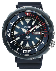
The first lesson in enhancing legibility is to write larger. While this might seem glaringly obvious, there are a few potential obstacles. It is difficult to be subtle and refined while using thicker fonts and one soon falls into the sports watch category. This has not prevented Bell&Ross from creating a typical dial clearly geared towards readability. The formula is mainly based on the distinctive font of the four large Arabic numerals that the brand has created. Generally speaking, Arabic numerals are more legible than Roman ones, and less so than hour-markers. Oversizing the latter enhances legibility… up to the tipping point where the trend is reversed. Seiko diving watches often flirt with the limits in this respect and this borderline approach has contributed to their success.
CONTRAST
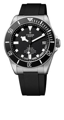
The second lesson involves making clear-cut distinctions. The tone-on-tone approach is hard to make out. Dial-free watches lack points of reference, and skeleton watches make things even worse by introducing an abundance of backdrops and varying depths. There is no surer way of losing visual grip, apart perhaps from peripheral scales such as a tachymeter. The most effective means is definitely white against a matt black background, as Tudor has done with its Pelagos models. Polished hands and sunburst dials are also to be avoided, since mirror-type effects disturb reading in both full sunshine and dim light. The advantage of contrasts is that they also work well on elegant models, confirmed by Breguet’s Classique 7147.
SEPARATE

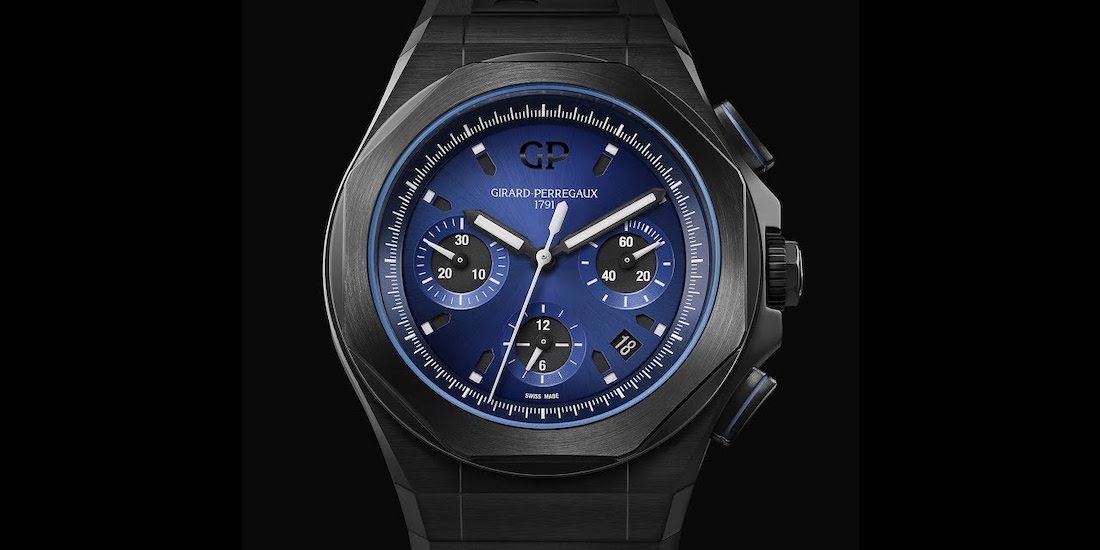
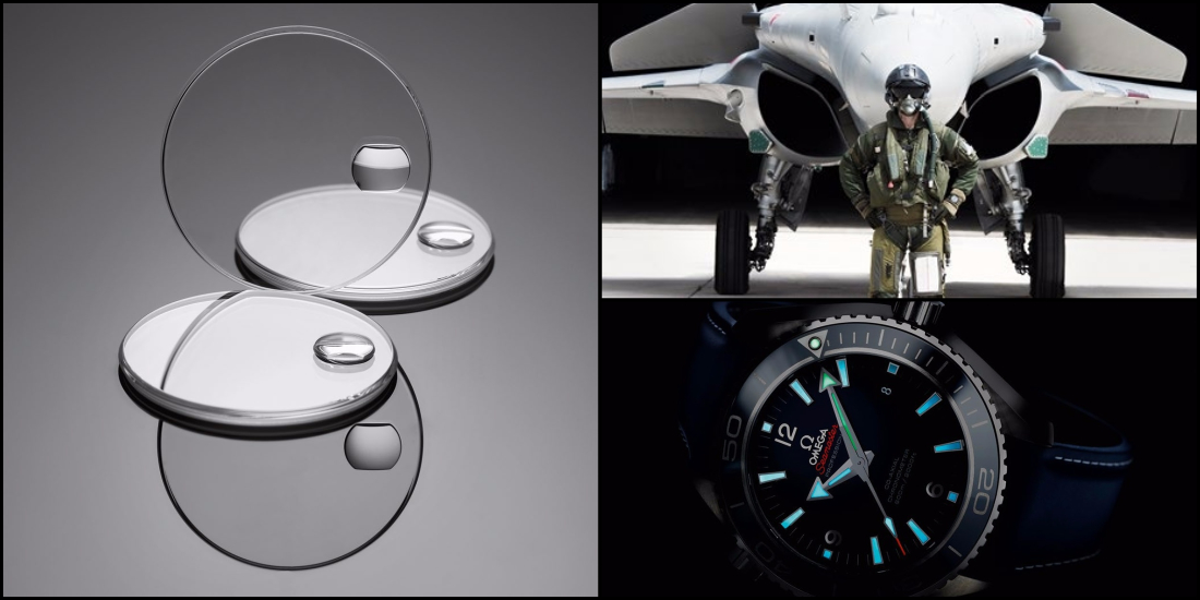
 The risk of multiplying indications is to generate confusion. Small seconds here, chronograph indications there, and what is the purpose of this 3 o’clock counter ? Some brands have proved able to arrange complications in a particular order. Breguet has created a perpetual calendar with indications appearing in a vertical line. And Patek Philippe has superimposed the minutes and hours of its automatic chronograph, as seen with the Nautilus 5980. Conversely, certain separations also work well. Omega has optimized the nocturnal legibility of its Seamaster Planet Ocean watches by using two different Super-LumiNova® colors for the hours and minutes.
ENLARGE
The last option is artificial enlargement. Rolex provides the most clear-cut example, having already patented in 1953 its Cyclops magnifying lens to enlarge the date. But the approach can also be more subtle. Some watches equipped with complication modules end up with a strongly recessed date disk and to avoid this cavernous effect, IWC has filled the date aperture of its Portofino Moon Phase watch with invisible optical fibers that raise the date and make it appear to be on a level with the dial. A highly original bright idea.
PAUL’S POSITION
Putting legibility at the top of your wish list does not necessarily mean that your options are limited. A quick search on WorldTempus for the word “legibility” returned 377 articles containing the word, so there is plenty of choice. When sufficient attention is paid to the details, even tone-on-tone, ultra-thin and skeleton watches can be perfectly readable. As is so often the case in fine watchmaking, the devil is in the details.