The ever broader range of vibrant and cheerful colors bursting onto the watchmaking scene these days is creating a firework display that enlivens cases, dials, gemsettings and even the very life of the watch.
An archeologist looking at watch catalogs from just 20 years ago would be struck by the lack of color that would make him feel as if he were observing a prehistoric period of watchmaking’s approach to chromatic options. At that time the choice for cases was confined to the gray shades of steel or white gold, or else yellow gold. As far as dials were concerned, black, gray and white were complemented only by gold-toned and occasionally coppery hues. And as was generally seen in jewelry, diamonds – white ones of course – reigned supreme. Since then, watchmakers have been struck by a polychromic epidemic that has completely overturned watch designs. Almost as if art had leapt directly from the dark and strictly academic approach of the 18th century to the pure colors of Fauvism, without any transition via Renoir and impressionism.
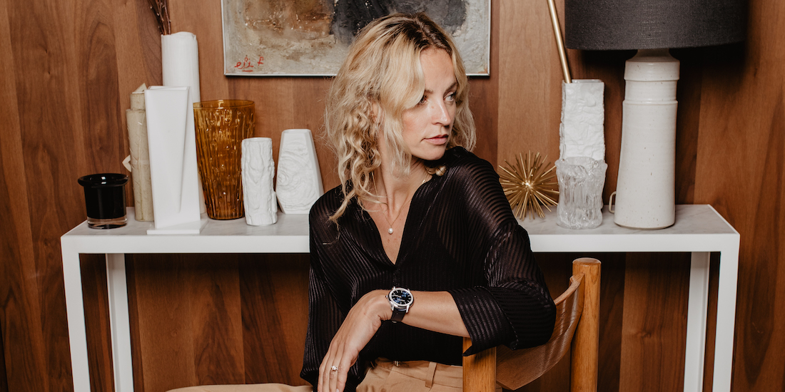
VITAL
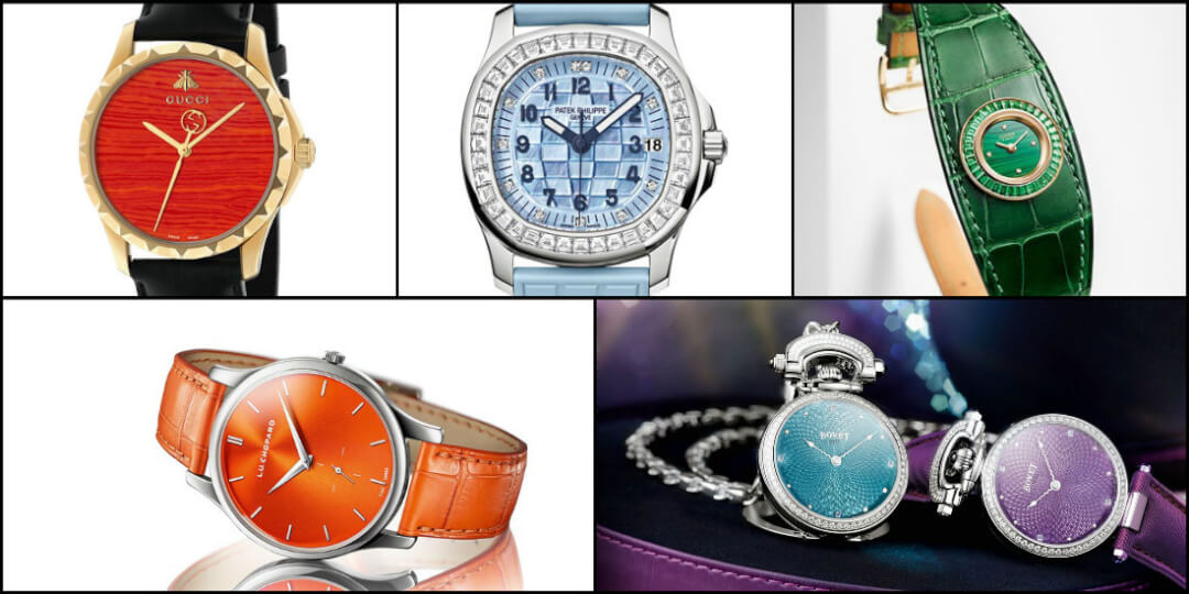
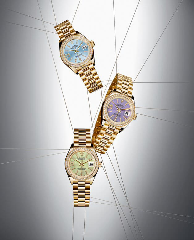 Color means life and it now pervades the entire watch industry. It offers an infinite repertoire of shades and of demure or daring matches, as well as textures that change the way a model catches the light. Red expressed through every nuance, from old rose to crimson, rubs shoulders with pale green through soft linden green to pine green, or the intense glow of malachite. Baby blue, sea blue, navy blue and royal blue are applied to mother-of-pearl, gold, fired enamel or aventurine glass, enhanced by sunburst, opaline, shiny or matt effects. Vivid orange and turquoise create a striking contrast with almond green and a gentle pastel lavender shade. Watches’ newfound penchant for color stems from the present age and an ever increasing desire to stand out from the crowd. It is a fashion effect not in the sense that it is short-lived, but rather in terms of openness to the constant ebbs and flows of life, novelty and creativity in the field of apparel and accessories. It is a matter of engaging with women who believe that a watch should not be an exception to the rule. Their wardrobe is brimming with diversity and their wrist must follow suit. The ever increasing and very real plurality of case shapes and sizes is not matched by that of colors. Gold is no longer only yellow, but also comes in pink, red, beige and honey tones. Gray is pale with silver, muted with platinum, or matt with sandblasted, beadblasted and PVD effects. Ceramic has introduced cases to immaculate white, iridescent grey and brown. Even an avant-garde material such as sapphire has begun to show symptoms in the shape of an unmistakable rosy blush.
VIBRANT
If there is one constant factor amid all these upheavals, it would be the role of precious stones. They are in fact no longer necessarily precious. Whereas diamonds, sapphires, emeralds and rubies used to get all the attention, high jewelry has now adopted tourmaline, amethyst, onyx, opal, garnets and jade. Even monotonous blue sapphire has shown up in yellow, green, pink, cognac and mandarin orange variations. This shock wave has electrified high jewelry watches, blasted conventions, energized creativity and made color a staple element of contemporary watch design.